ABOUT ME
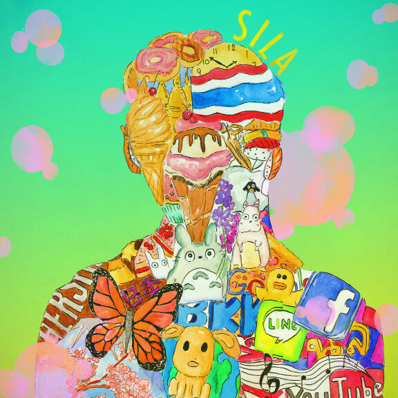
Sila is a Senior Designer and Marketing Strategist based in New York City and Connecticut. He has a passion for creating visuals that tell stories. He has worked in many industries and specializes in print and web design, marketing, and brand development. His work combines creativity, research, and a touch of humor. He enjoys making designs that connect with people in a meaningful way. Sila is always learning and growing. He looks forward to collaborating and creating something great with others.
BROADFEET
Broadfeet Motorsport Equipment is a young company full of ideas revolutionizing and discovering new products for today’s SUVs and CUVs. They produce automotive parts, exterior, and interior accessories, and related products...
IDFR
IDFR™ is a subsidiary of Broadfeet that specializes in providing an extensive range of automotive accessories and supplies, such as bumper guards, alarm systems, and audio systems. As the internet continues to grow, we recognized...
LGBTQ+ POSTERS
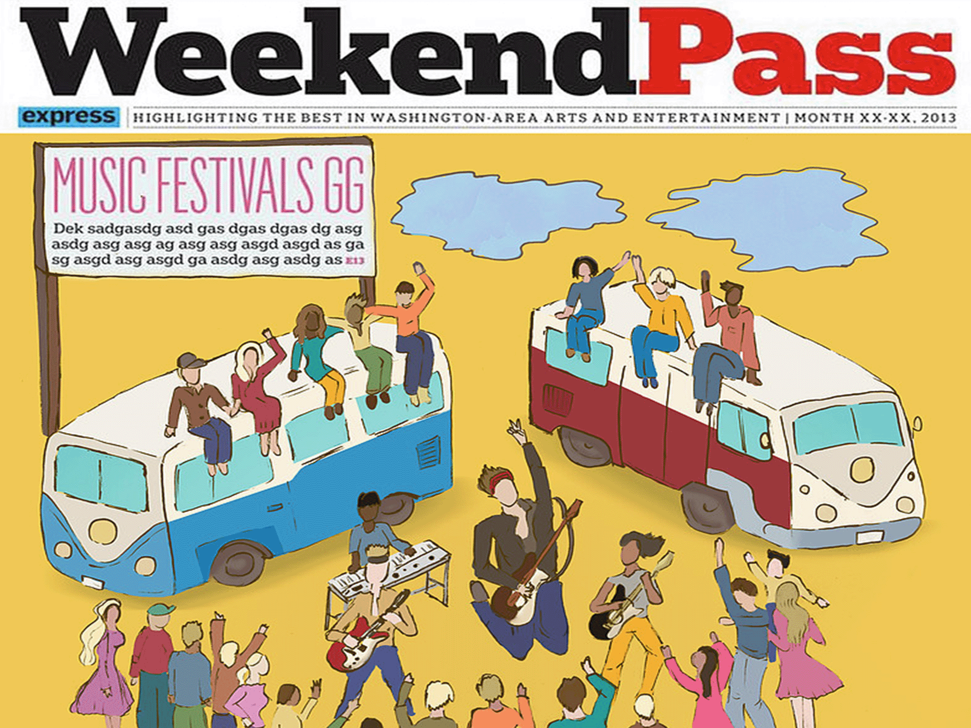
The LGBTQ+ pride poster series is my personal project. The goal is topromote and support the rights and equality of LGBTQ individuals. With the first six posters, I wanted to...
PERSONAL WORK
During my leisure time, I find joy in designing various projects that allow me to explore my creativity and express my artistic inclinations. One of my favorite pursuits is creating...
DROPBOX
REDESIGN
In this personal project, my aim was to improve the usability and engagement of the Dropbox iOS interface and website by redesigning it. As a regular user of Dropbox for backing...
NEIGHBOURHOOD BRANDING
SoHo, short for South of Houston Street, is a vibrant neighborhood in Lower Manhattan, New York City. This area has a rich history and cultural significance...
3D MODELING
As a self-taught individual, I have dedicated time to mastering 3D modeling. My process involves creating a scene based o n my concept by combining sketches with 3D models and various elements. I thrive on the challenge of...
JOONBUG
During my internship, I was responsible for creating and implementing innovative concepts and designs for various event venues in New York City, including highly anticipated occasions like Halloween, New Year’s Eve, and Christmas...
FREELANCE PROJECTS
As a freelance graphic designer, my primary role is to create and deliver a diverse range of professional and visually captivating materials, including logos, flyers, websites...
DIGITAL
ILLUSTRATION
I am proficient in creating a diverse range of digital illustrations, including editorial and children’s book illustrations. During my leisure time, I enjoy sketching...
PHOTOGRAPHY
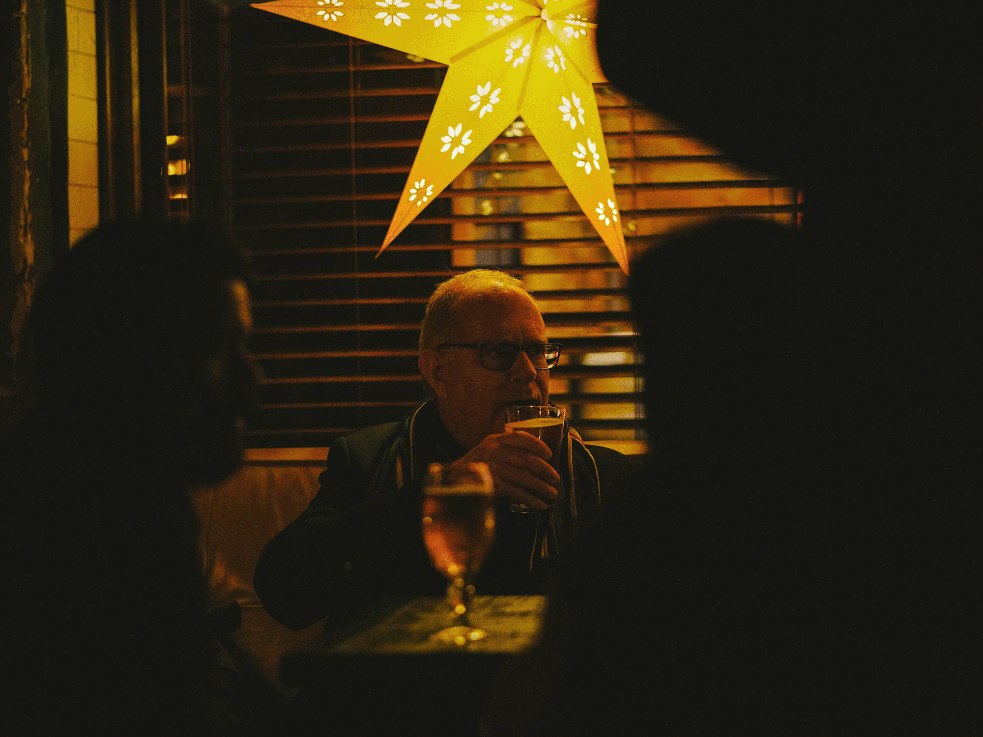
My passion for photography began during my high school years, and since then, I have developed a particular interest in capturing human moments, action, and humor...
BROADFEETABOUT BROADFEET
Founded in 2006, Broadfeet Motorsport Equipment specializes in high-quality automotive parts and accessories for SUVs and CUVs. With a strong commitment to innovation and quality, Broadfeet continues to expand its product line and distribution across the U.S., striving to meet the needs of automotive enthusiasts with cutting-edge aftermarket accessories.THE CHALLENGE
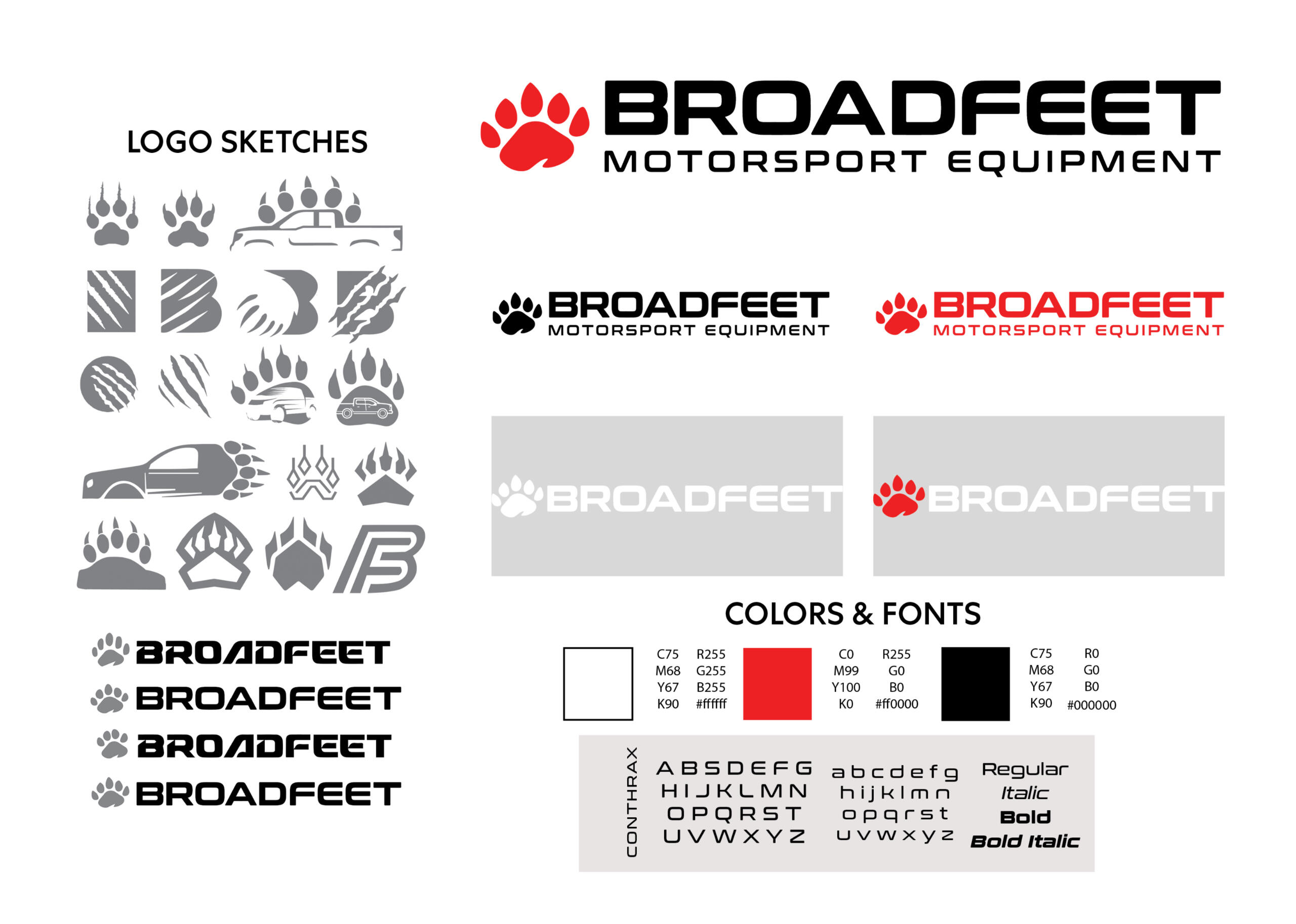
Over time, we realized that our brand identity had become outdated and lacked clarity. As a designer, my goal was to effectively communicate Broadfeet’s value and innovation through a fresh, modern visual direction—while still honoring its reputation as a leading manufacturer and distributor of high-quality automotive accessories. It was essential to maintain the original red, black, and white color palette, as these colors symbolize energy, excitement, and sophistication. My team and I focused on refining Broadfeet’s brand identity, making it more cohesive, eye-catching, and distinctive while incorporating a contemporary touch.THE SOLUTION
To achieve this, my team and I conducted brainstorming sessions and competitor research to better understand industry trends. We decided to simplify the website and logo, starting with multiple sketches and design iterations. The redesigned logo features modern, appealing typography and incorporates a bear claw, symbolizing energy and strength.Beyond the logo, we applied the new design direction across all branding materials, including flyers, business cards, and product packaging, ensuring a consistent and professional look. The website was restructured for a seamless user experience, making it easier for customers to navigate and find the products they need. We also optimized the website for search engines (SEO) to improve visibility and attract more potential customers.THE RESULTS
The updated branding received positive feedback from customers and resulted in increased sales and brand recognition. By blending simplicity with bold design, we successfully reinforced Broadfeet’s core values, innovation, and commitment to quality. The refreshed identity has helped Broadfeet stand out in the competitive automotive accessories market, ensuring a stronger connection with customers while maintaining the essence of the brand.
DIGITAL DESIGN:
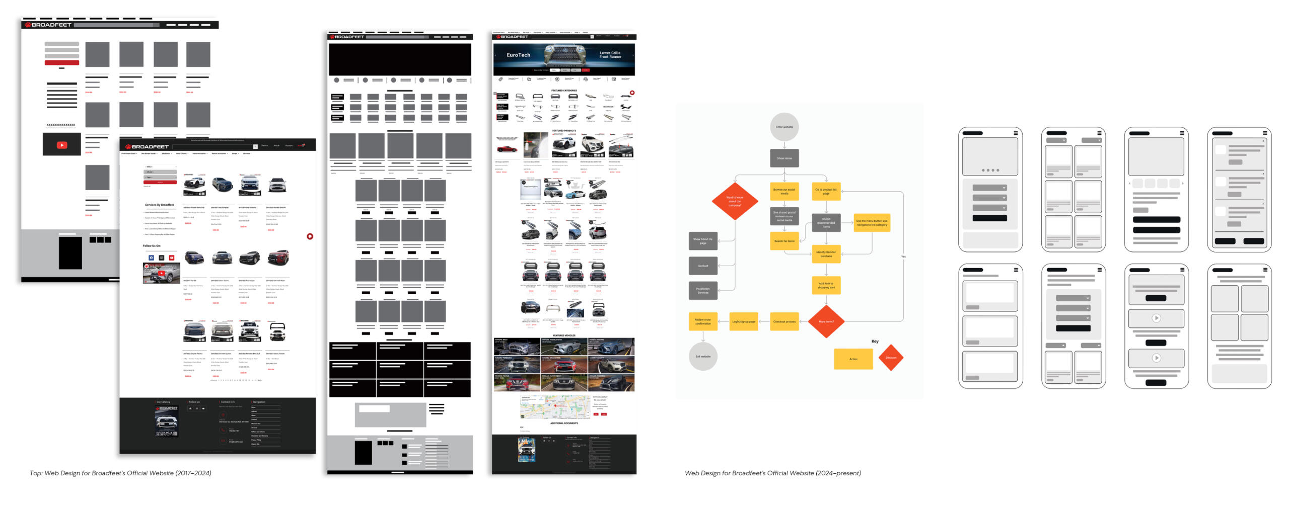
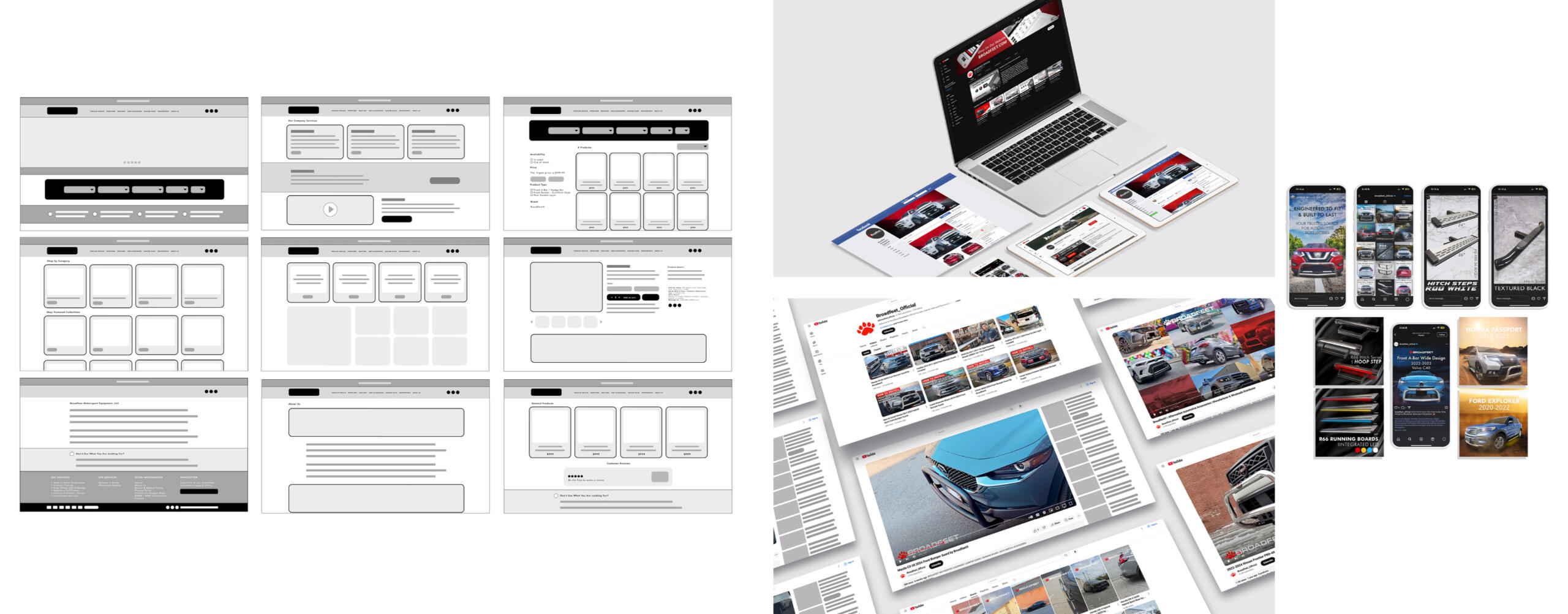
As part of Broadfeet’s digital transformation, I worked closely with our software engineering team to develop and refine the company’s website, aiming to create a clean, intuitive, and visually appealing platform that showcased our products and services while providing a seamless user experience.In the initial version, we structured the website to balance strong visuals with functionality, integrating high-quality images and product descriptions. However, performance issues arose due to excessive data, and user feedback highlighted slow loading times and difficult navigation. As a result, we recognized the need for an overhaul to improve usability and performance.For the redesign, we streamlined content, simplified product descriptions, and improved layout clarity. We optimized performance by compressing images and enhancing the backend for faster load times. The redesign maintained Broadfeet’s modern aesthetic, refining the color scheme, typography, and visuals, while also ensuring mobile optimization for better accessibility and navigation.The final version of the website was faster, more user-friendly, and resulted in increased engagement, improved search rankings, and higher sales. Although some grid issues remain, we continue to refine the site for better functionality and aesthetics. The redesign has proven to be a valuable investment, and we are committed to making ongoing improvements to enhance the user experience. This project allowed me to collaborate across departments and develop a stronger understanding of user-centric design, while also learning how to balance creative vision with technical constraints. By focusing on user feedback and continuous iteration, we successfully achieved a more streamlined and effective website.
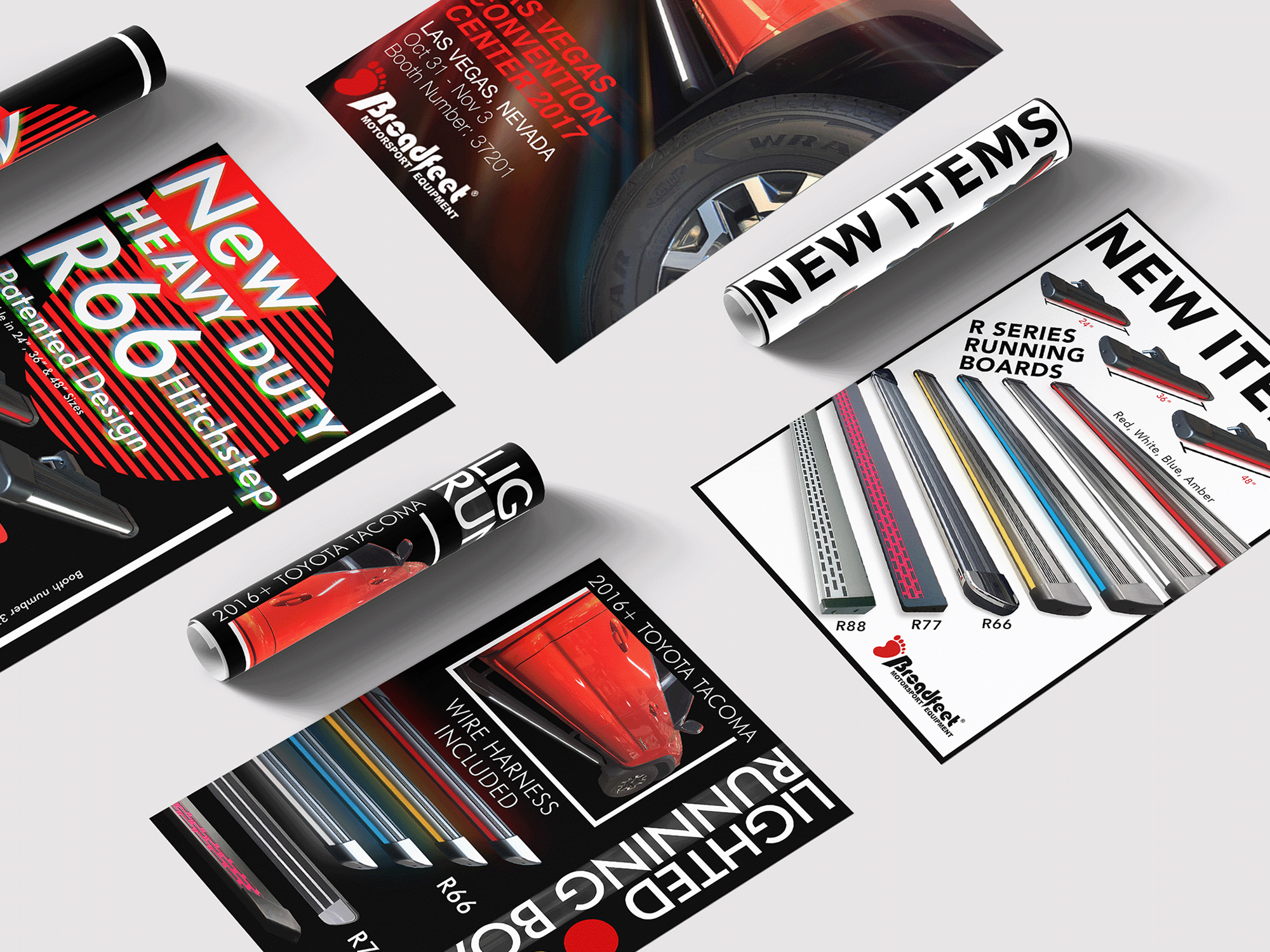
PRINT DESIGN:
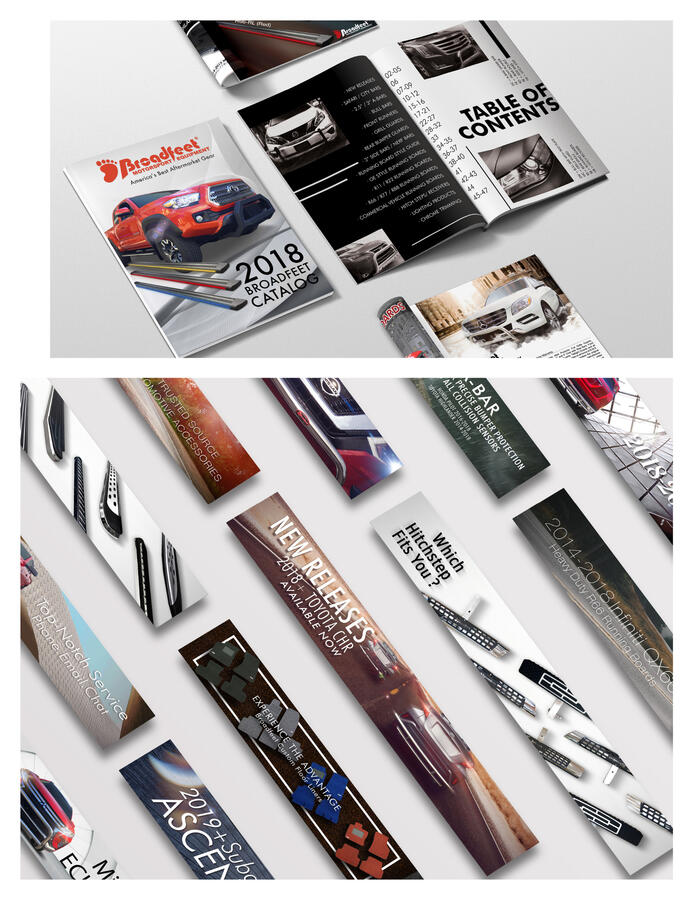
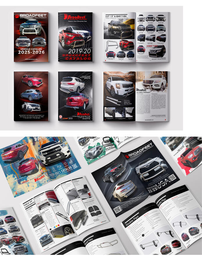
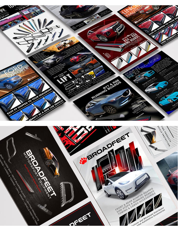
I had the opportunity to design a variety of print materials, including banners, brochures, business cards, postcards, catalogs, and flyer stands for major automotive events. My primary goal was to create visuals that not only communicated the brand’s identity but also captured the attention of potential customers.My design process began with concept development and sketching, where I explored composition, hierarchy, and layout techniques such as the Rule of Thirds to create balanced and effective designs. I paid careful attention to typography, often selecting modern sans-serif fonts for a clean and contemporary aesthetic. For the digital execution, I used Adobe Photoshop to enhance images and fine-tune layouts, ensuring each piece looked professional and polished. For vector-based designs like logos and banners, I utilized Illustrator to ensure scalability for larger prints. When working on brochures and catalogs, I relied on InDesign to organize and structure content clearly, enhancing readability and visual flow.In terms of color and typography, I focused on using bold, saturated colors that reflected Broadfeet’s energetic brand, while pairing fonts and hues thoughtfully to achieve eye-catching and cohesive designs. Before finalizing designs for print, I conducted a detailed review to ensure consistency, alignment, and overall print quality, optimizing files for bleeds, margins, and color profiles. By blending hand-drawn concepts with digital tools, I aimed to produce professional, engaging materials that helped elevate Broadfeet’s marketing efforts and ensured the brand stood out in the automotive industry.
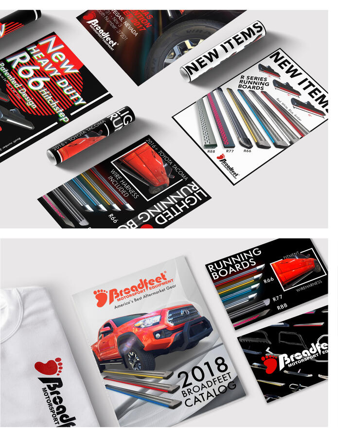

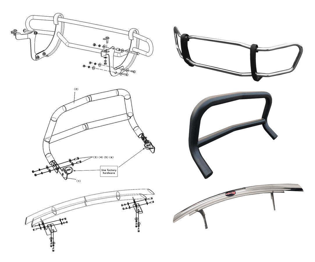
PRODUCT AND PACKAGING DESIGN:
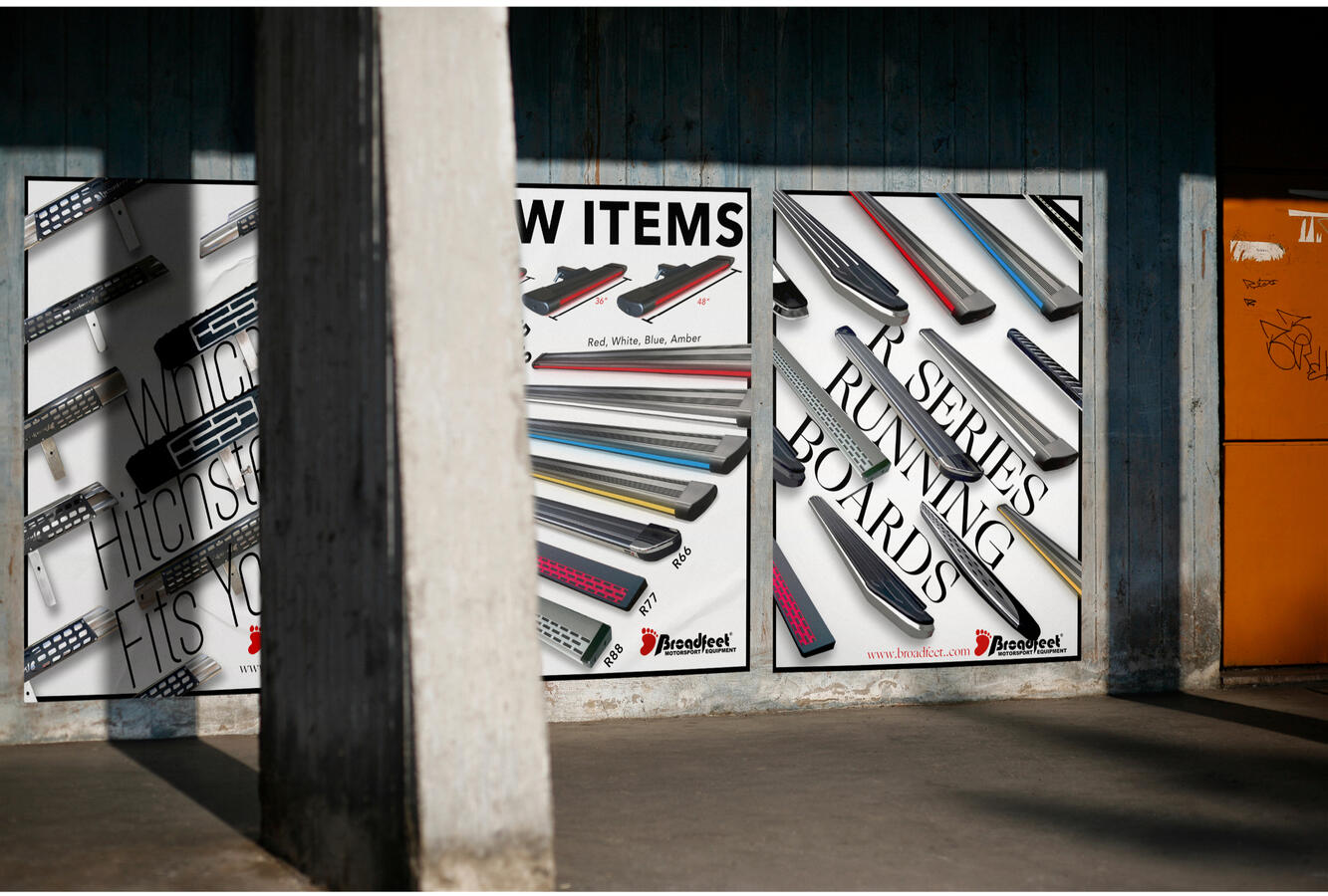
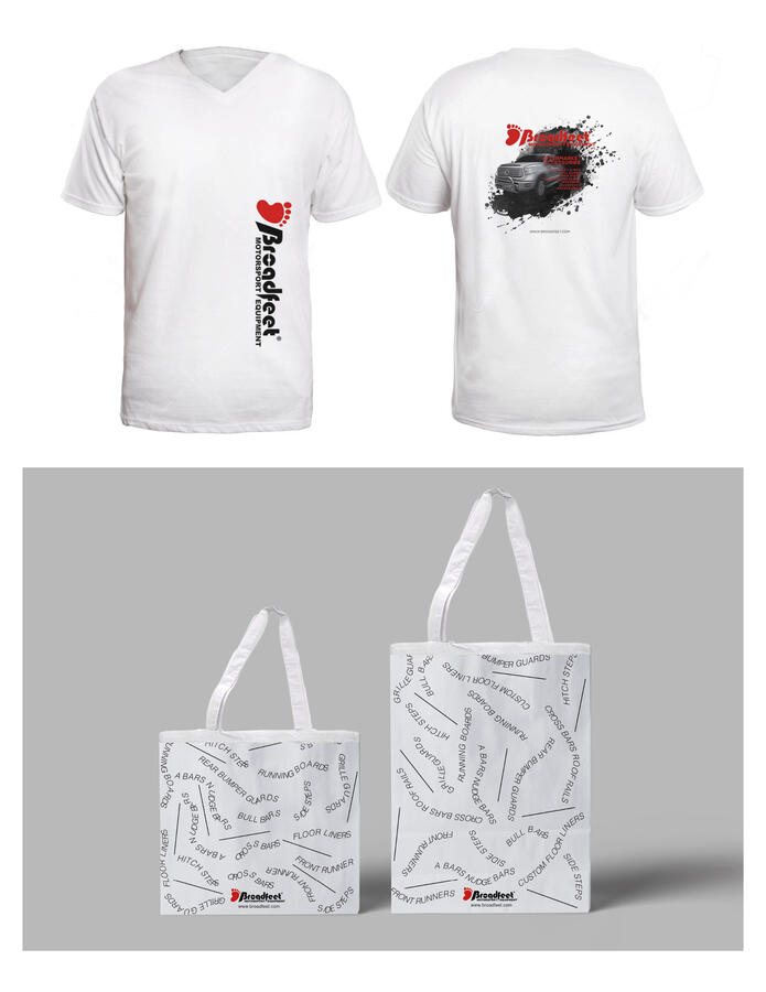
Beyond print materials, I also lead the product design and branding for a variety of automobile accessories, including Bumper Guards, Running Boards, Hitch Steps, Side Accessories, and Garage Accessories. As part of a company-wide rebranding effort, I designed custom T-shirts for employees and built upon the new Broadfeet logo to create a modern, cohesive brand identity that aligns with the company’s innovative vision.To ensure Broadfeet’s packaging and branding resonate with market trends and customer expectations, I implemented key marketing strategies such as maintaining brand consistency across all materials, utilizing bold typography and clear visuals for strong product recognition, and optimizing user experience through well-structured and visually engaging instruction manuals. My goal was to design high-impact packaging with vibrant colors, sleek graphics, and compelling layouts that would stand out in both retail stores and online marketplaces.The design process begins with research and strategy, where I analyze market trends and competitors to craft an informed approach. From there, I develop 3D models and blueprints to visualize packaging concepts, refining them with dynamic visuals and user-friendly layouts. The final step involves preparing print-ready files, ensuring a seamless transition from design to manufacturing, packaging, and marketing. By combining design expertise, strategic branding, and technical precision, I have helped Broadfeet strengthen its market presence while reinforcing its reputation as a leader in aftermarket automotive accessories.

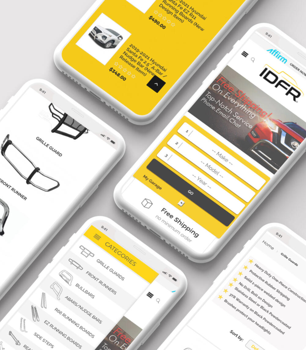
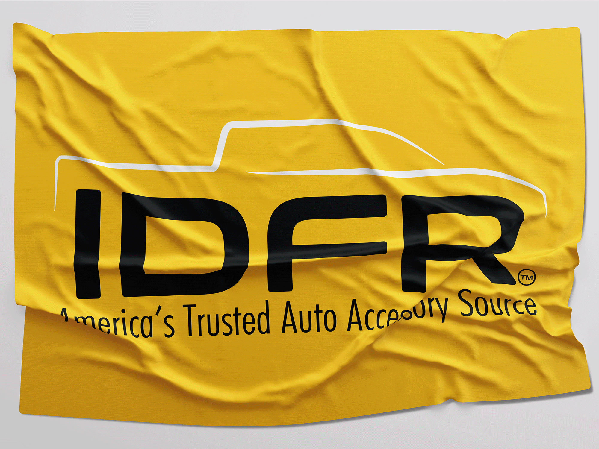
IDFRABOUT IDFR™
IDFR™ was a subsidiary of Broadfeet, specializing in a wide range of automotive accessories and supplies, including bumper guards, alarm systems, and audio systems. As the internet continued to grow, we recognized the importance of strengthening our online presence to better serve our customers. Unfortunately, due to economic inflation and the impact it had on the business, we made the difficult decision to close the company in 2020.CHALLENGE
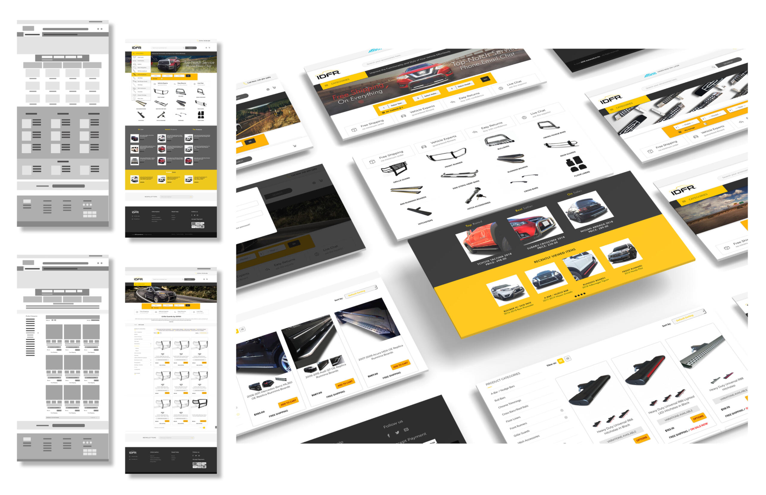
Our primary challenge was establishing a website that was user-friendly, secure, and capable of providing an exceptional customer experience. We aimed to create a website that was visually appealing and easy to navigate, while maintaining a level of security that customers could trust when making online purchases.SOLUTION
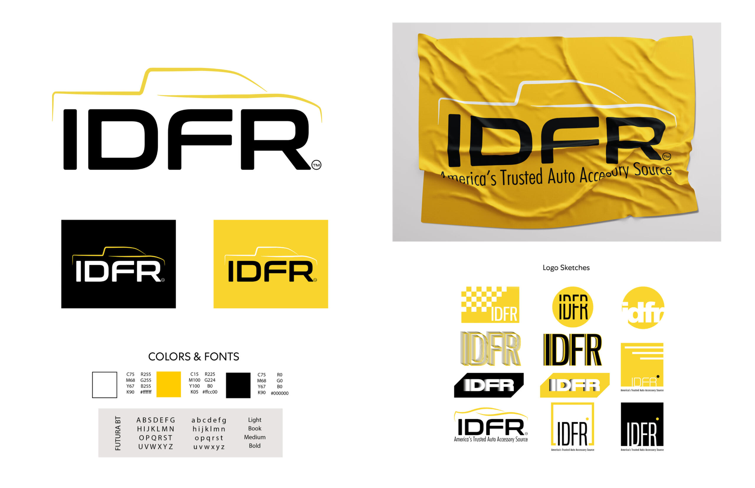
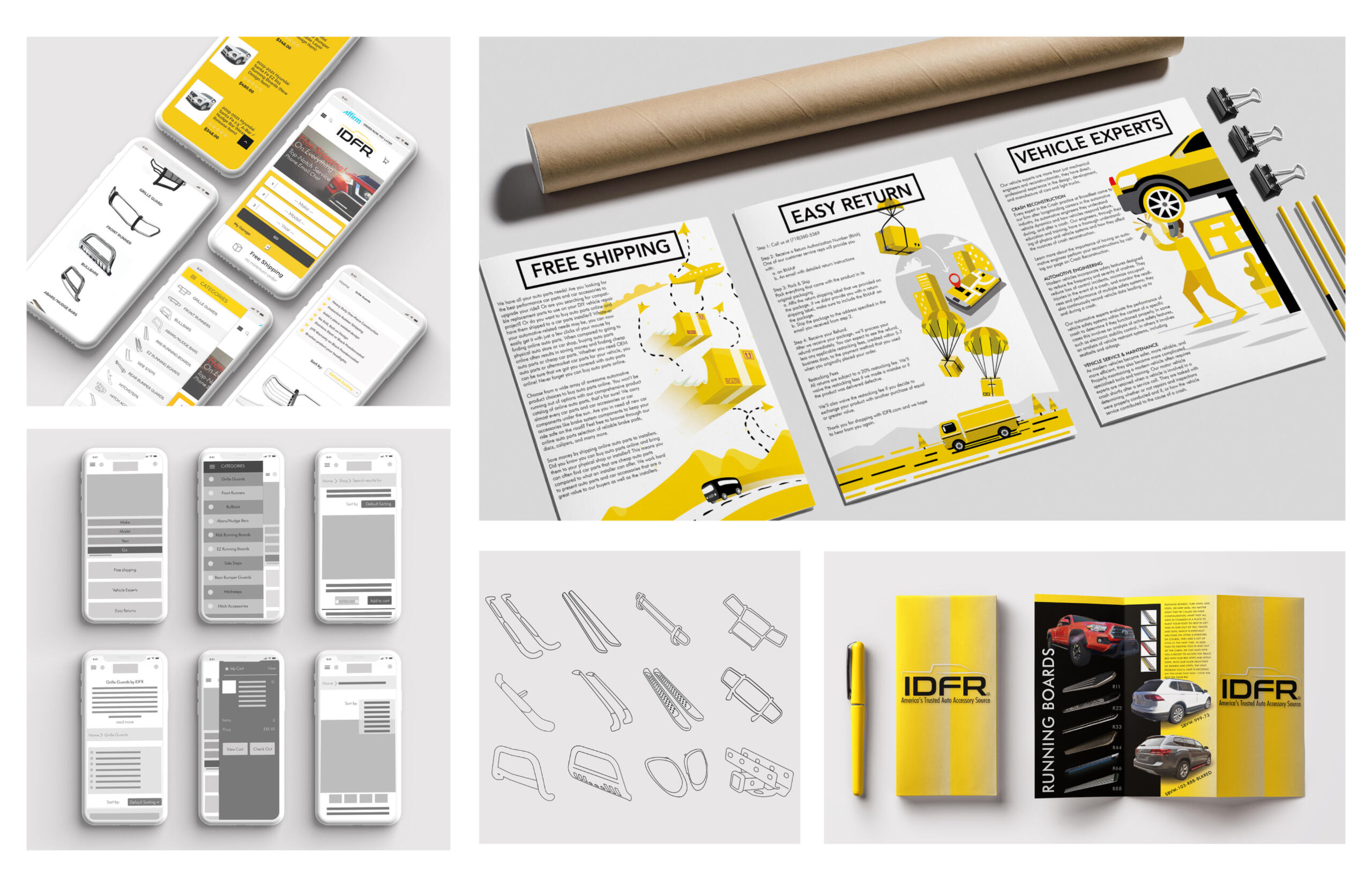
To meet this challenge, we developed a striking visual identity featuring a bold color palette of yellow, black, and white, which reflected our brand’s energy and simplicity. The logo was designed as a fusion of a pickup truck and a curvy typeface, symbolizing dynamic movement. We also created custom-designed icons to enhance the branding throughout the website. In addition, we designed brochures and flyers as part of our comprehensive branding strategy, which aimed to offer customers a seamless and memorable experience with our brand.
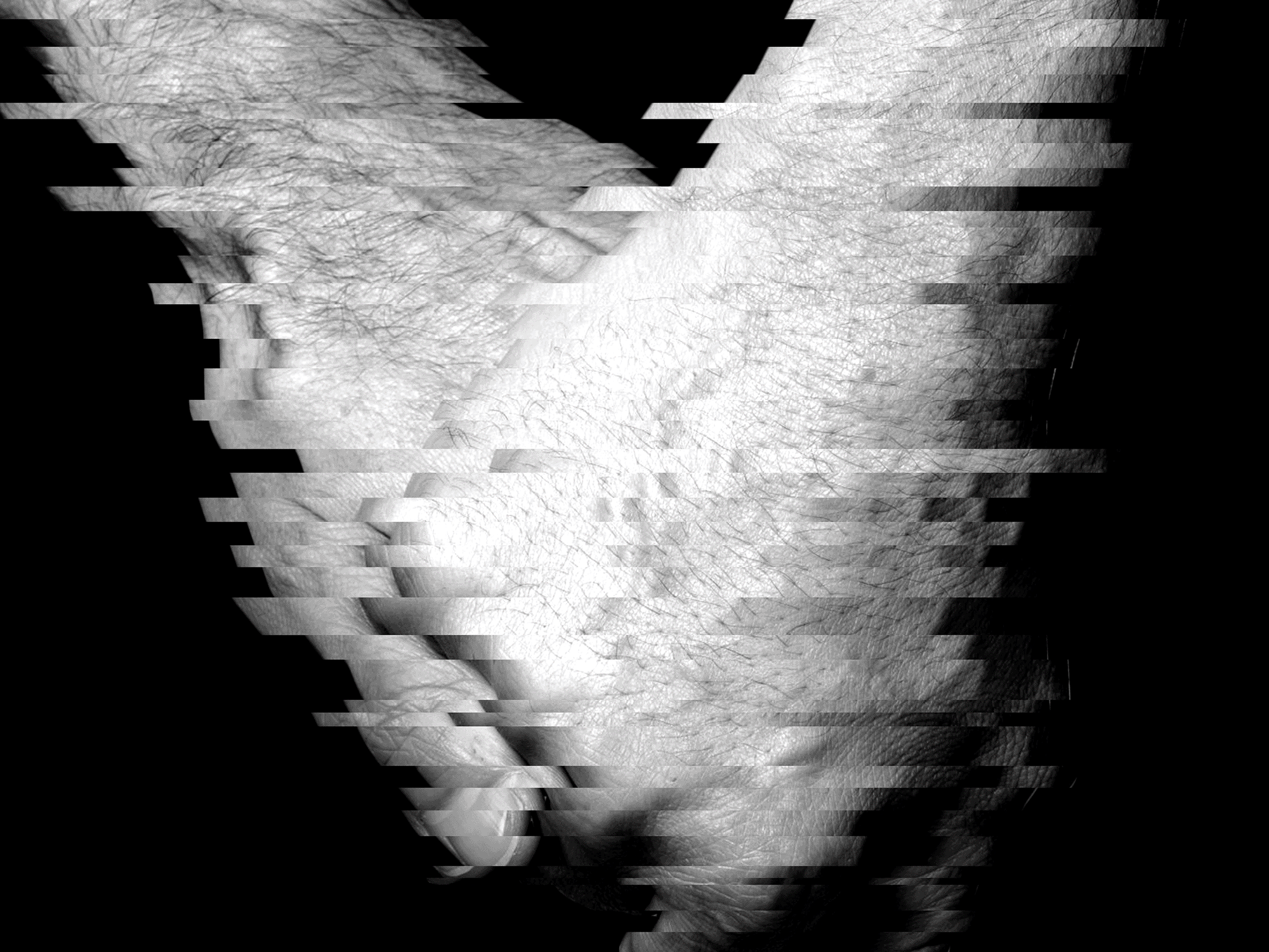
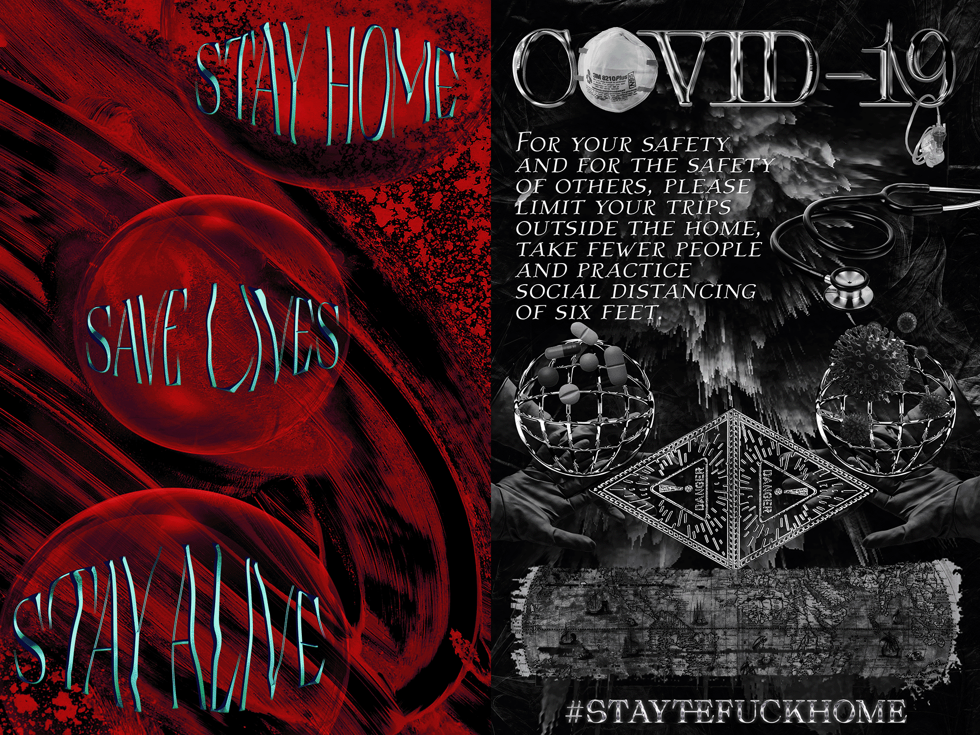
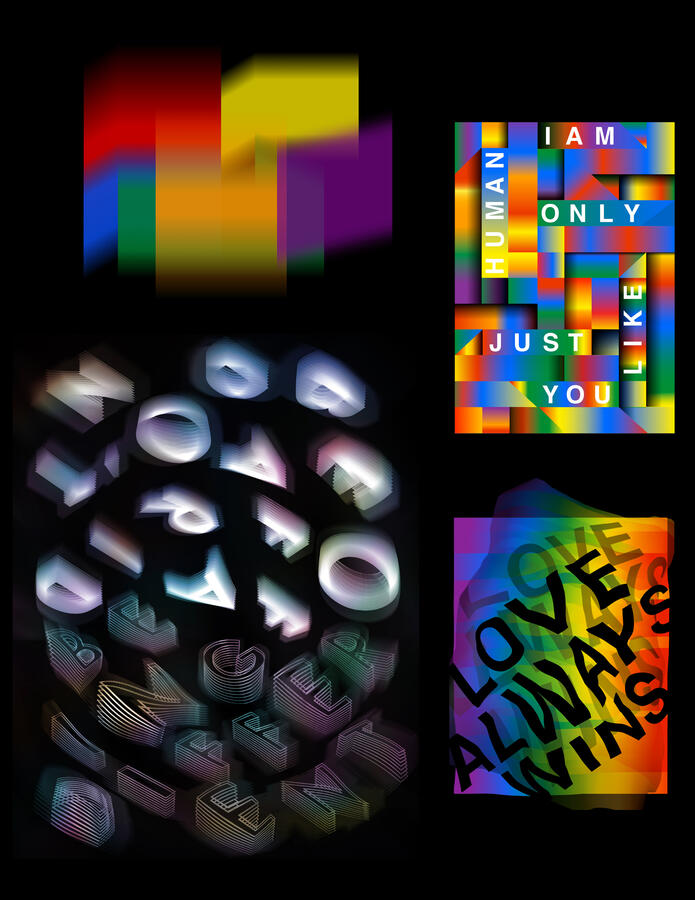
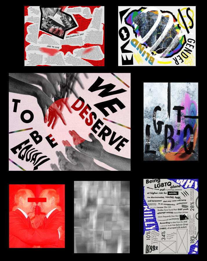
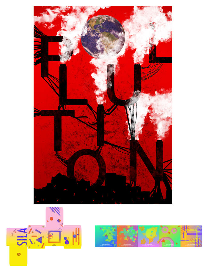
LGBTQ+ PRIDE POSTER SERIES
The LGBTQ+ pride poster series is a personal project aimed at promoting and supporting the rights and equality of LGBTQ+ individuals. Through the first six posters, I sought to shed light on the fact that many countries still hold negative perspectives toward the LGBTQ+ community. I used red to evoke feelings of anger and hate, reflecting societal rejection, while blue symbolizes the sadness, anxiety, and depression often experienced by many community members.In this project, I adopted a sarcastic tone, which I conveyed through symbols, typography, colors, and shapes. The result is a unique and impactful series of posters that challenge societal norms. I experimented with various techniques, such as collage, drawing, painting, and scanning, to create expressive and meaningful artwork. As the creator of this poster series, I aim to advocate for the LGBTQ+ community by using art to communicate their struggles and triumphs.
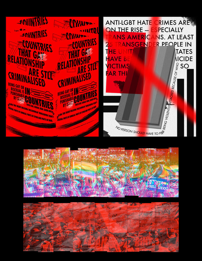

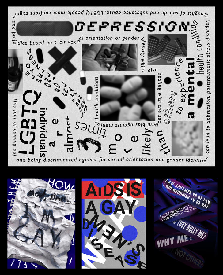
A key focus of this series is addressing the mental health challenges faced by many LGBTQ+ individuals, particularly anxiety and depression. These issues are a sad reality within the community, and I wanted to bring attention to them through my work. The use of blue, gray, and black in the posters symbolizes the confusion and emotional strain many face, highlighting the psychological toll of societal pressures.To enhance the emotional depth of the work, I experimented with various techniques such as white spaces, expressive typefaces, and image distortion. These elements helped create a sense of tension and turmoil, reflecting the internal struggles that members of the LGBTQ+ community often endure. As the creator of the series, I am dedicated to using my art to raise awareness and support mental health initiatives for the LGBTQ+ community.
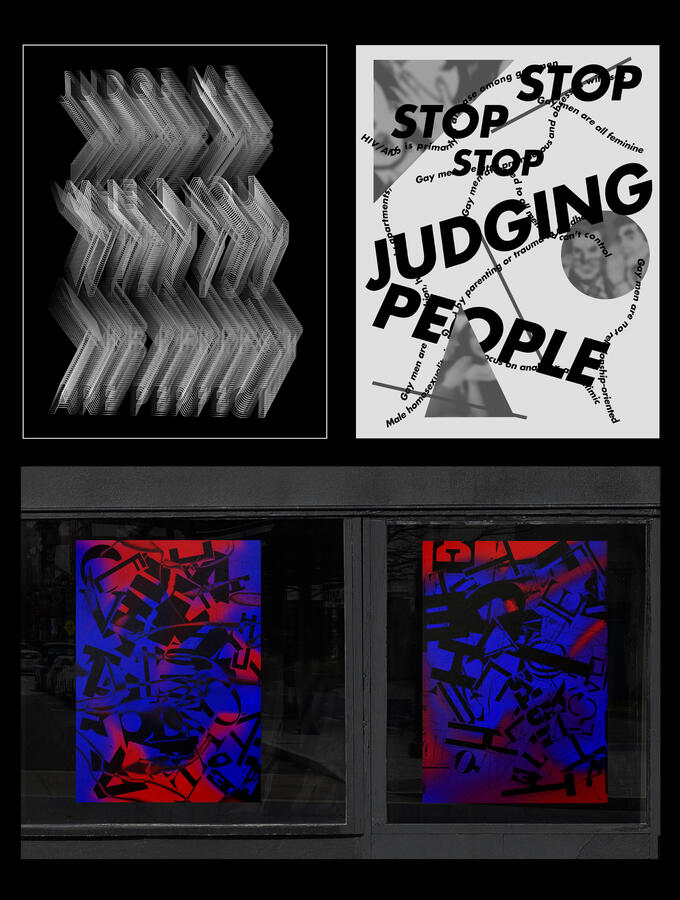

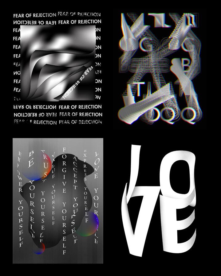
At the same time, I wanted to convey a message of hope and unity, inspired by the colors of the LGBTQ+ flag. The rainbow colors represent a powerful symbol of pride and identity, which I incorporated into the posters to celebrate this sense of togetherness. These colors not only represent struggle but also resilience, love, and the ongoing fight for equality.Finally, I introduced movement and energy into the designs by experimenting with gradients, blurry effects, and collage techniques. Collage allowed me to layer images and textures, creating striking and dynamic compositions. With this series, I hope to inspire pride, unity, and advocacy within the LGBTQ+ community while raising awareness about the struggles and triumphs they face.

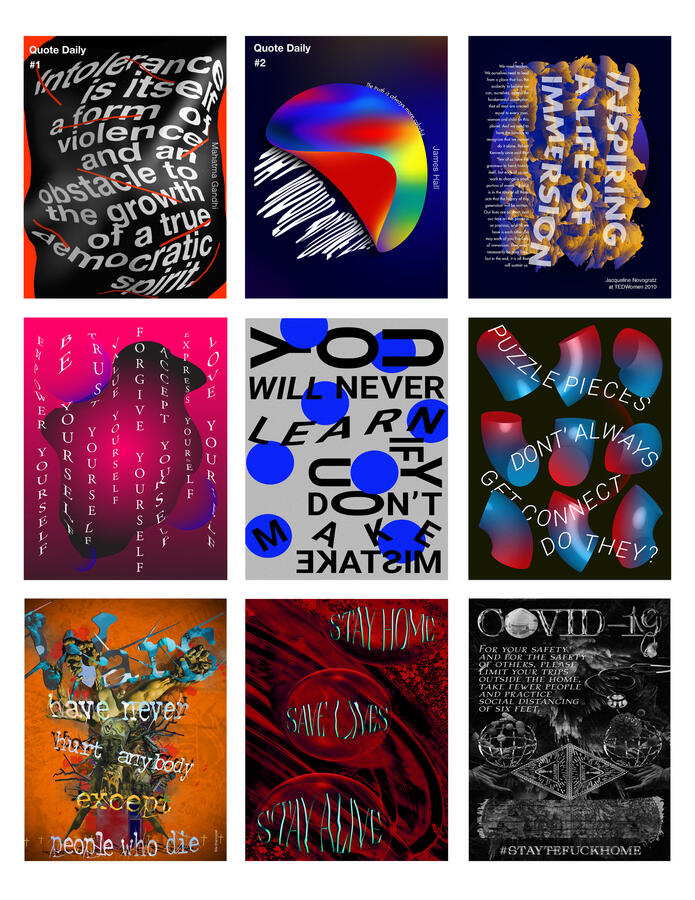
PERSONAL WORK
During my leisure time, I enjoy designing various projects that allow me to explore my creativity and express my artistic inclinations. One of my favorite activities is creating experimental posters that reflect pressing global issues, such as global warming, human rights, and mental health. These projects provide me with the opportunity to capture the essence of these topics while sharing my personal perspective. I also find joy in discovering inspiring quotes and experimenting with typography to bring them to life visually.I am constantly seeking ways to expand my skill set and embrace new tools and techniques, particularly within Photoshop and Illustrator, to elevate the quality of my designs. Additionally, I have developed a passion for handcrafted paper and collage, often incorporating these elements into my work to add a unique, tactile touch. These creative pursuits not only push me to grow as a designer but also help me create visually intersting and meaningful pieces.
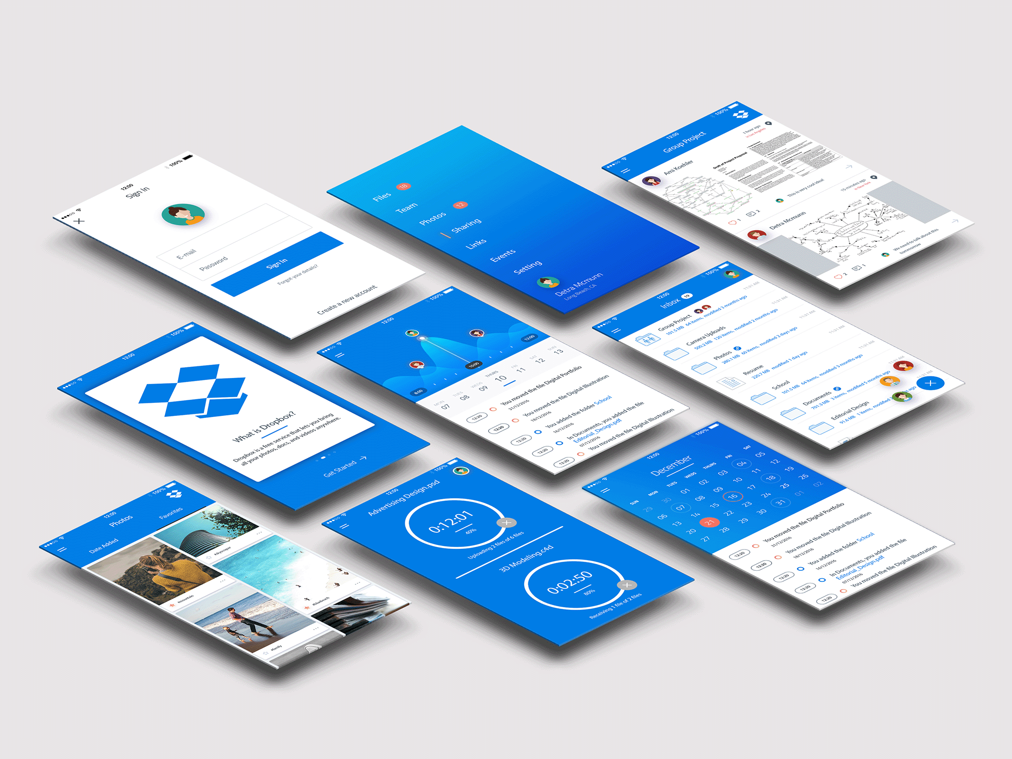
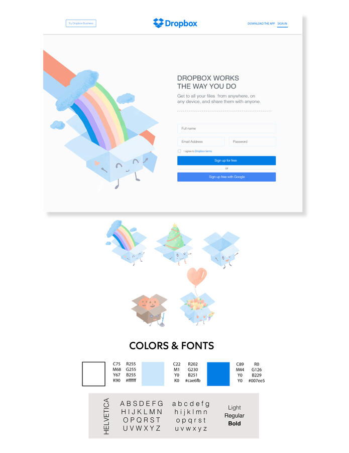
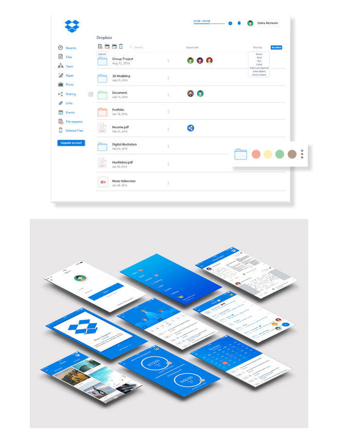
DROPBOX REDESIGN
Dropbox has always been a tool I’ve used both personally and professionally. However, as a regular user, I noticed a few areas where the experience could be improved and made more engaging. This led me to take on a personal project to redesign the Dropbox iOS interface and website. My goal was to enhance the usability, navigation, and overall enjoyment of using the platform.I started by sketching out ideas, including a playful approach to the Dropbox logo. I transformed it into a fun mascot with different actions for holidays and special occasions, bringing a sense of fun and relatability to the main page. For example, I created doodles for events like Valentine’s Day and Pridet Month, adding a festive and visually appealing touch to the platform.In addition, I aimed to modernize the interface with a consistent blue color scheme across the application and added more customization options for folders. These changes were designed to streamline organization, allowing users to categorize their files more efficiently and with greater flexibility. Ultimately, this redesign aimed to create a more intuitive and enjoyable experience for Dropbox users.
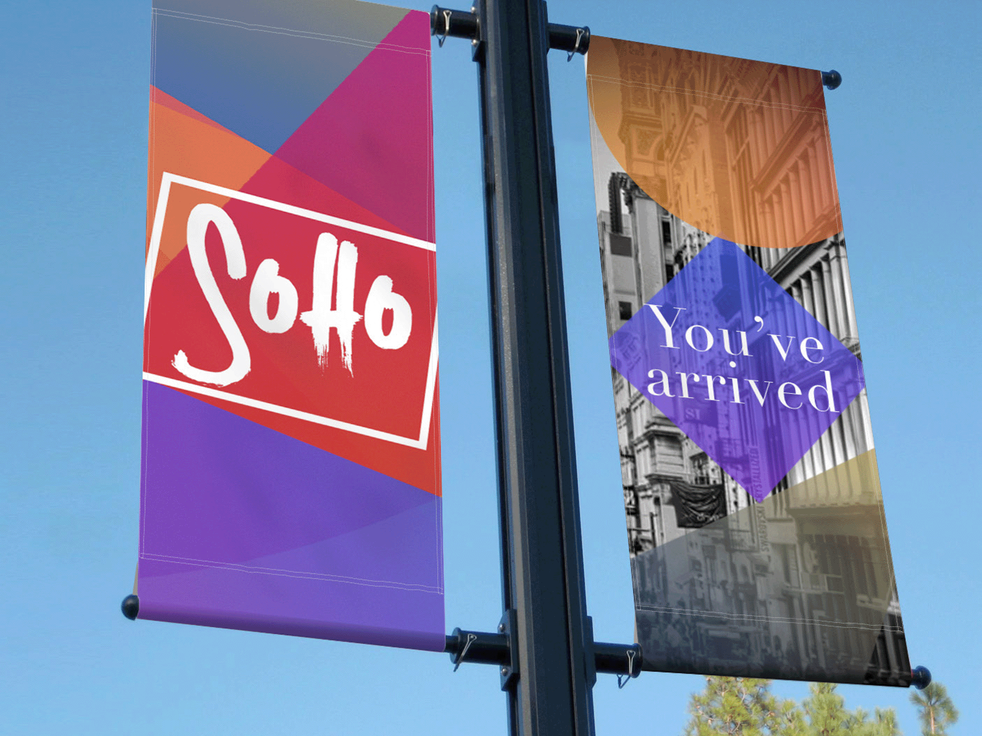
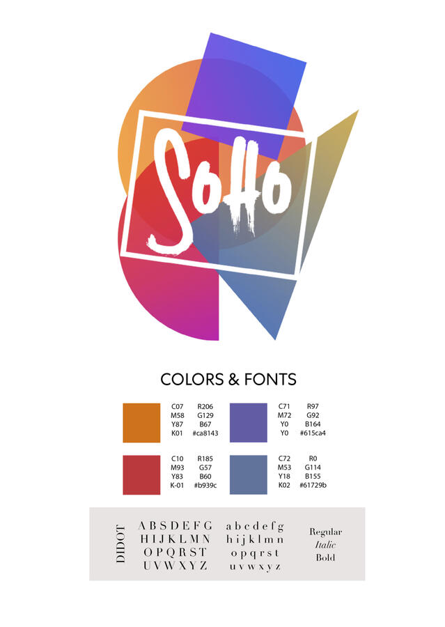
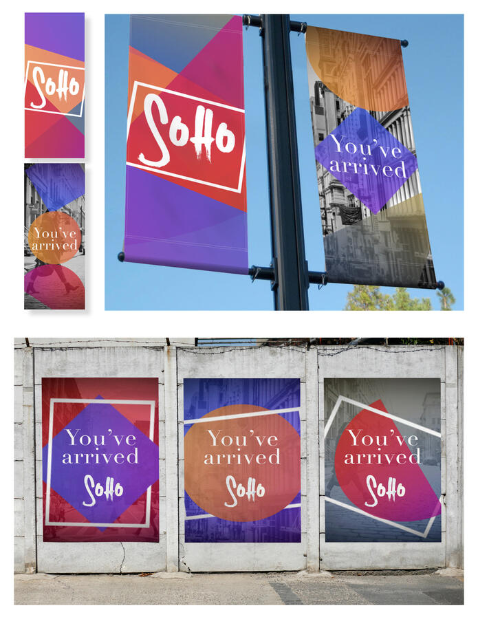
NEIGHBORHOOD BRANDING, SoHo
This is another personal project that I hold dear. While walking through the SoHo area in NYC, I felt so inspired by the neighborhood’s unique charm. SoHo, short for South of Houston Street, is one of my favorite places to stroll around. Known for its vibrant history and cultural significance, SoHo has been a hub for artists’ lofts and galleries since the 1960s. Today, it continues to attract visitors with its trendy boutiques, upscale stores, and iconic cast-iron architecture.Inspired by SoHo’s energetic and rebellious spirit, I decided to embark on a project to celebrate the neighborhood’s distinctive character. My aim was to create a fun and engaging design to promote SoHo, so I came up with a variety of pieces, including lamppost banners, bus shelter ads, and branded merchandise that captured the area’s bold, artistic vibe.To reflect the unconventional nature of SoHo, I incorporated dynamic, uneven shapes and used both serif and handprinted fonts to convey a multicultural contrast. The vibrant colors added energy and excitement, engaging passersby while reflecting the lively atmosphere of the neighborhood. Each piece of the project featured elements unique to SoHo, such as its iconic cast-iron architecture, street art, and cultural landmarks.Through this project, I hoped to showcase the beauty and diversity of SoHo while honoring its rich artistic heritage. It was both a challenging and rewarding experience, giving me the opportunity to push my creative limits and apply my design skills in a meaningful way.

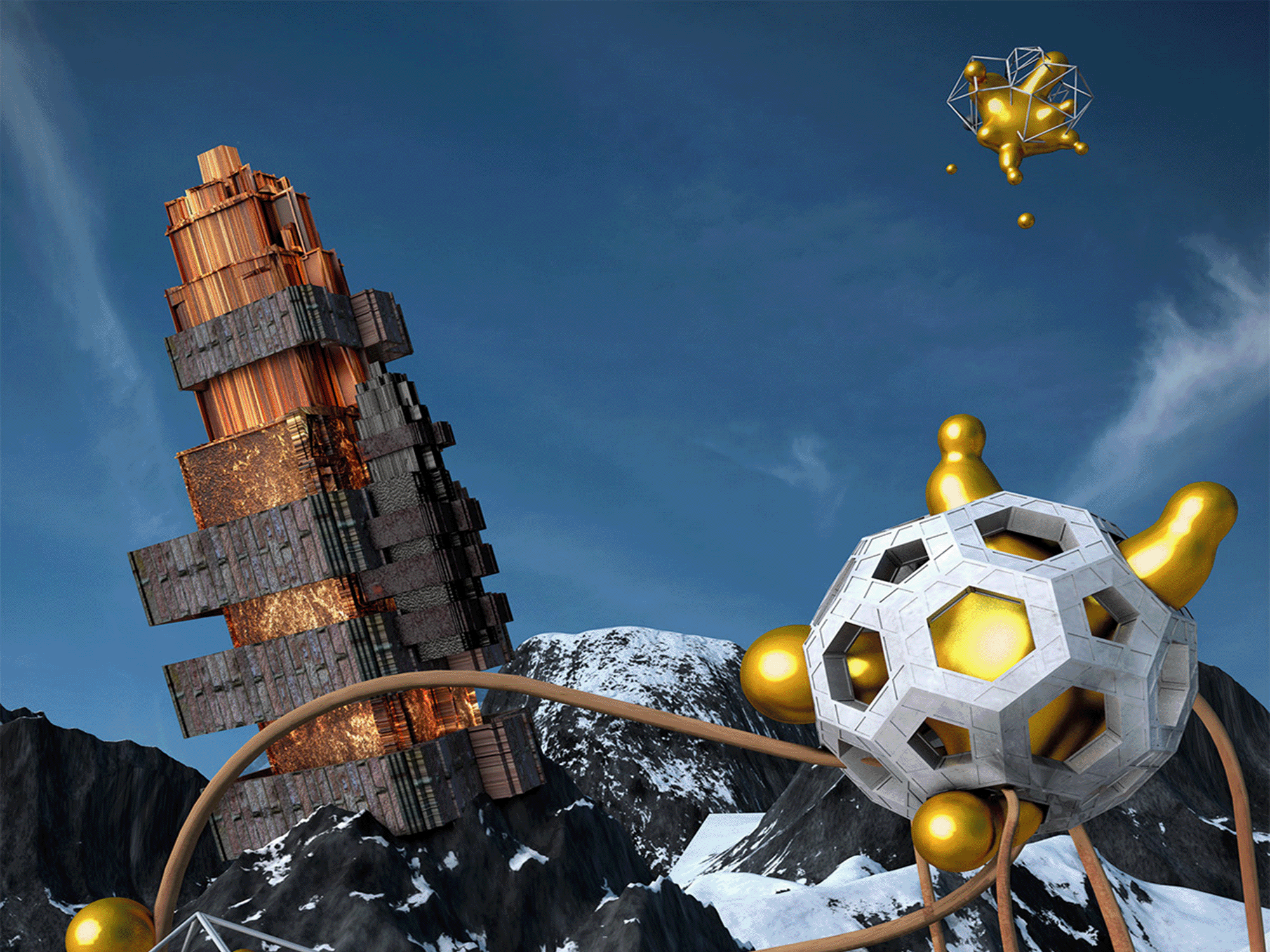
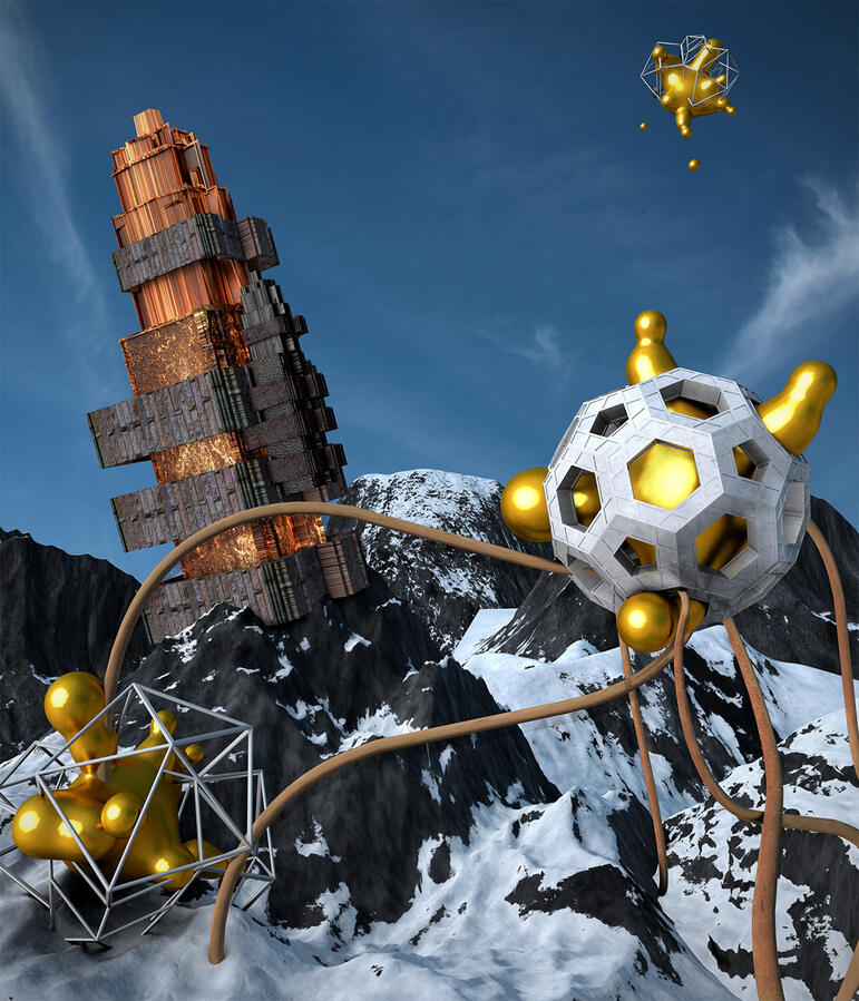
3D MODELING
As a self-taught individual, I have dedicated time to mastering 3D modeling. My process involves creating a scene based o n my concept by combining sketches with 3D models and various elements. I thrive on the challenge of experimenting with textures, colors, lighting, and perspective to create compelling scenes that are both accurate and realistic.


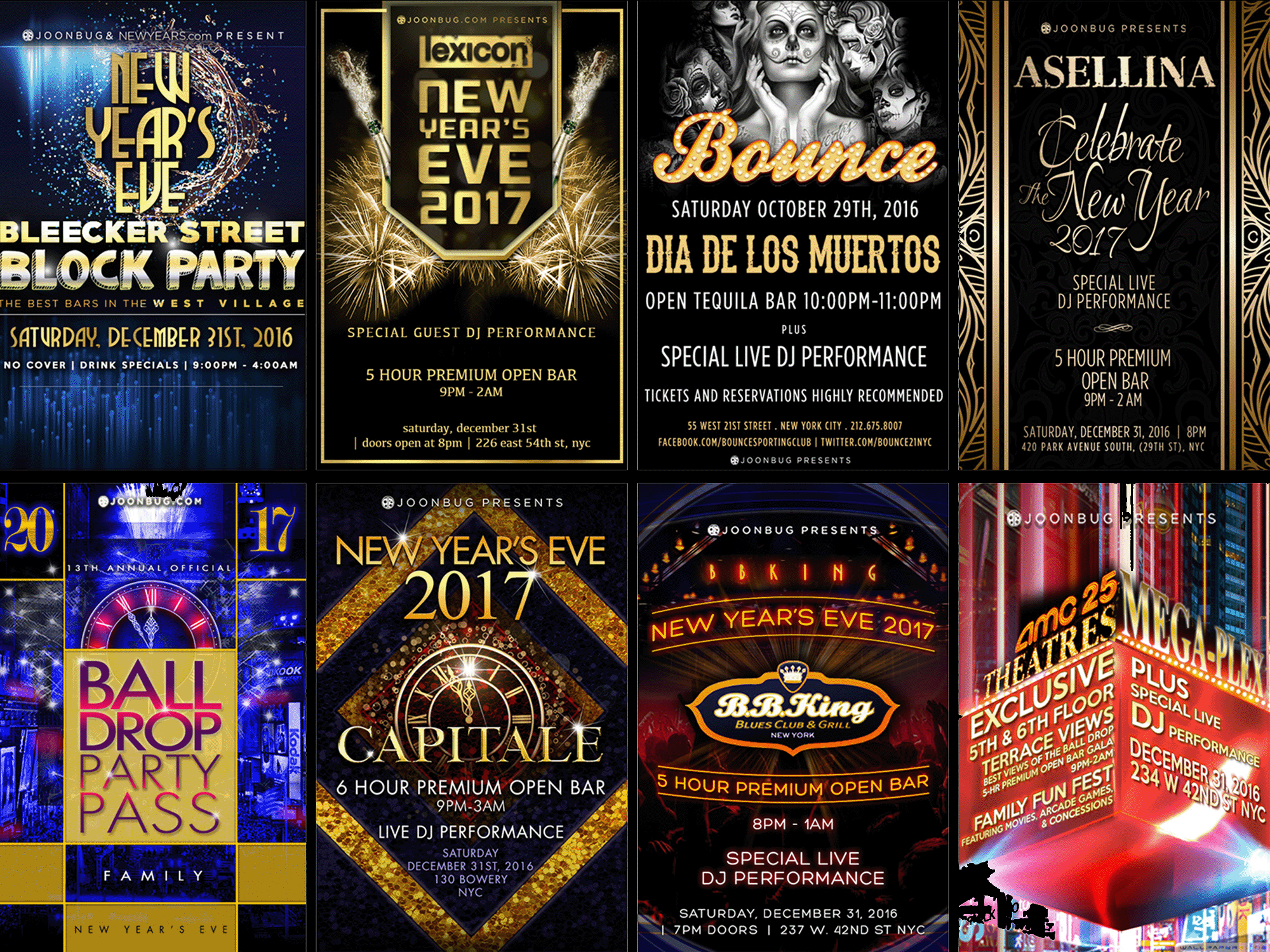
JOONBUG
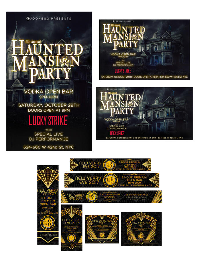
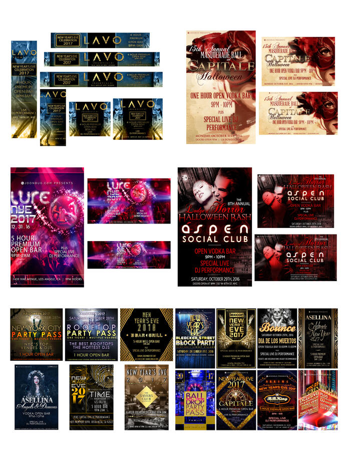
During my internship, I was responsible for creating and implementing innovative concepts and designs for various event venues in New York City, including highly anticipated occasions like Halloween, New Year’s Eve, and Christmas events. This involved designing visually appealing materials such as flyers, Google ads, and Snapchat filters to effectively communicate event details and attract attendees. I collaborated closely with the creative directors to ensure that the design concepts not only aligned with the company’s brand identity but also met the specific goals and expectations of each event. Through this internship, I gained valuable experience in creating compelling designs that not only captured attention but also exceeded client expectations.
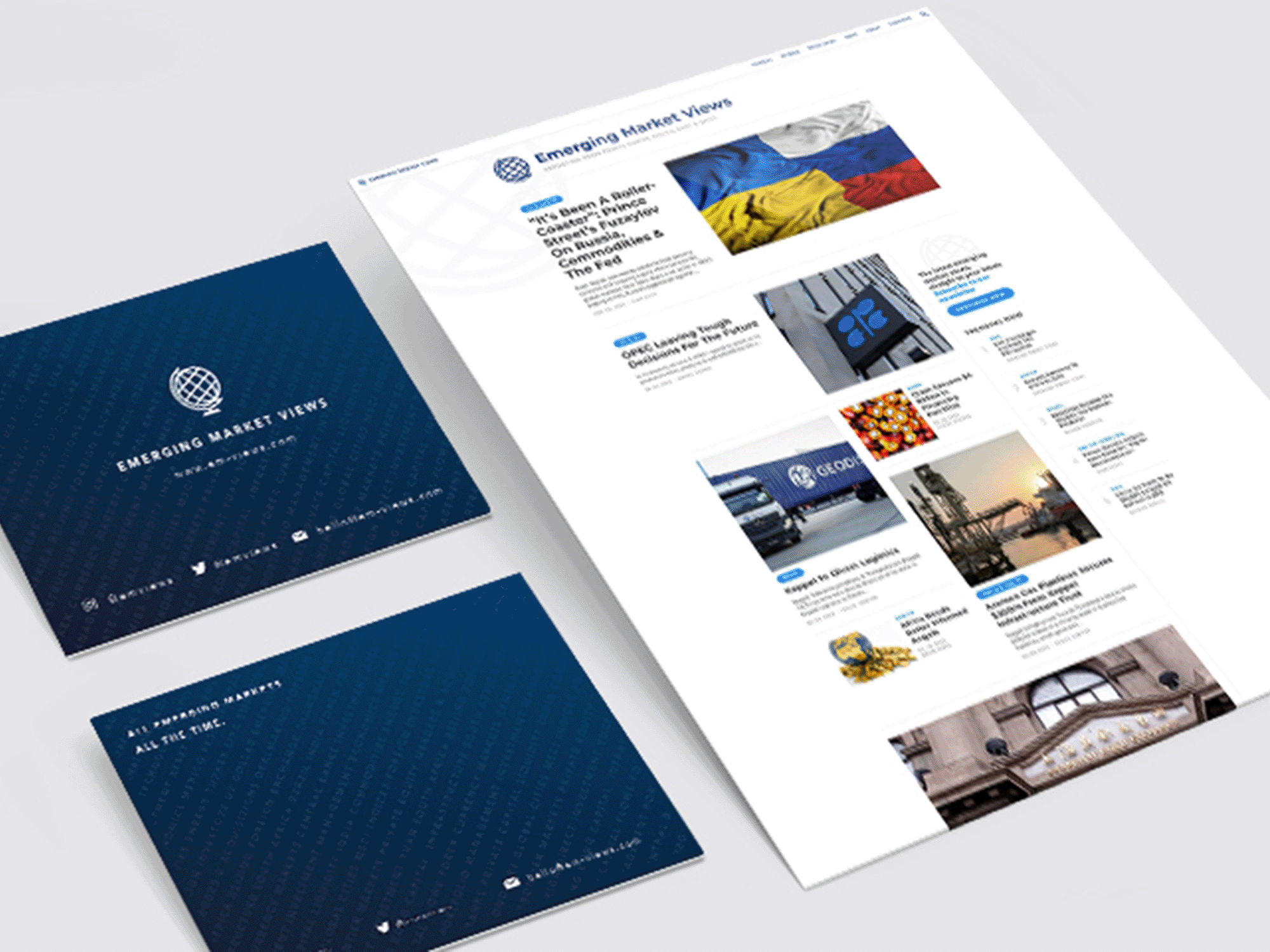
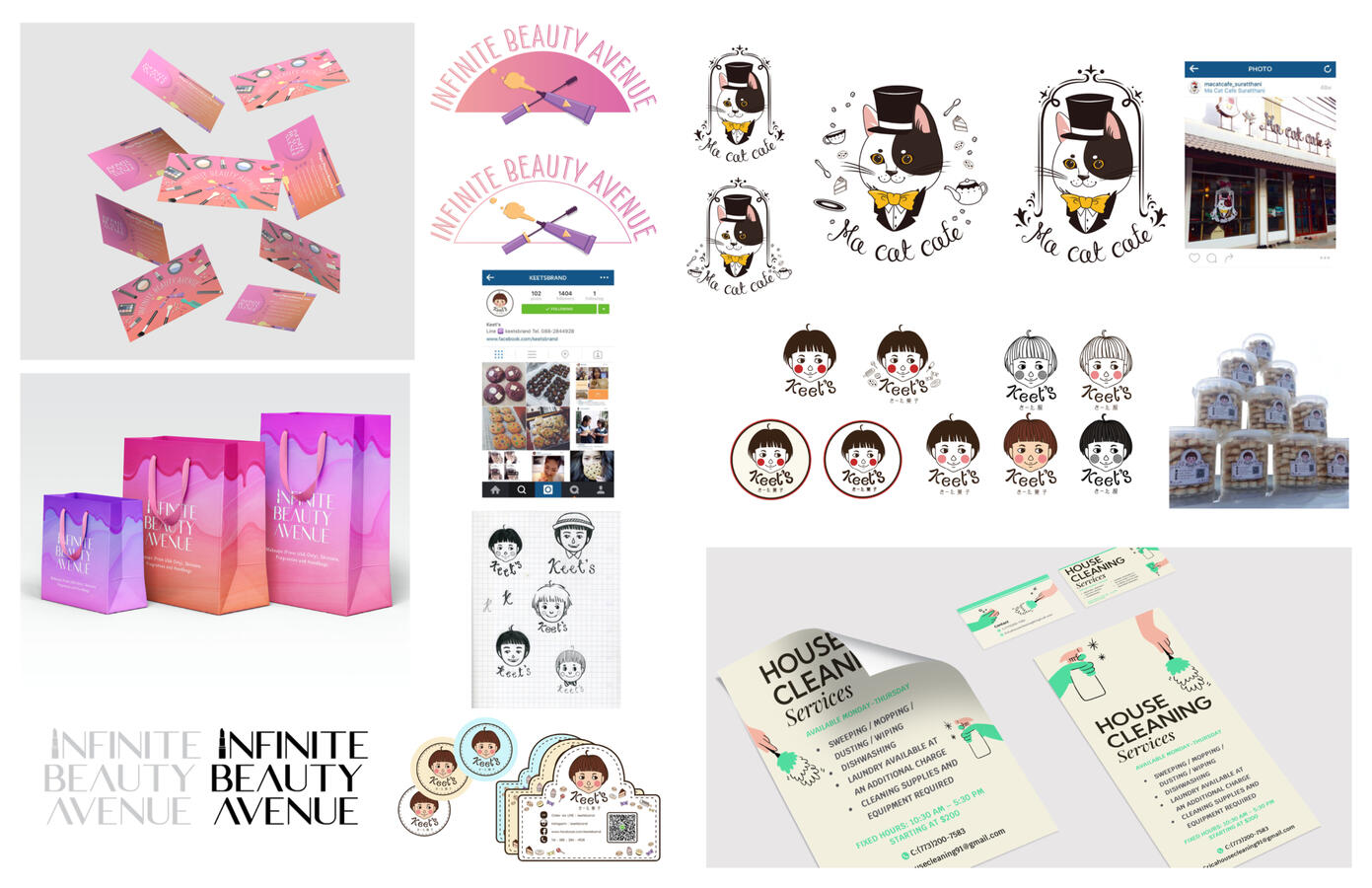
FREELANCE PROJECTS
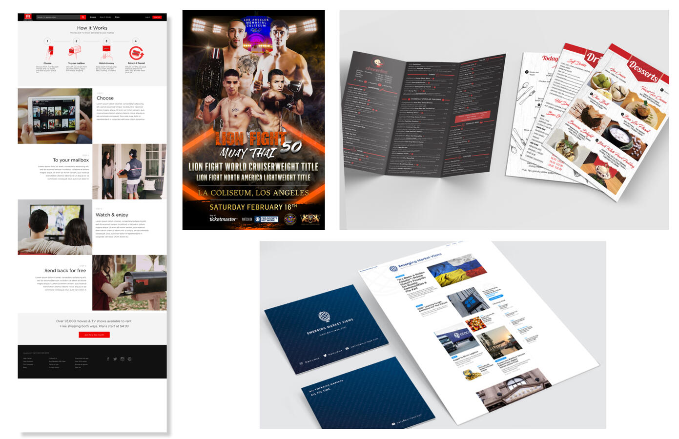
As a freelance graphic designer, my primary role was to create and deliver a wide range of professional and visually engaging materials, such as logos, flyers, websites, newsletters, posters, and brochures. Each project was carefully tailored to meet the specific needs of my clients, ensuring their brand message was effectively communicated to their target audience. Over the past few years, I had the privilege of working on numerous projects, from small businesses to larger enterprises, where I applied my skills and creativity to produce impactful designs that aligned with my clients’ visions and helped them achieve their goals.
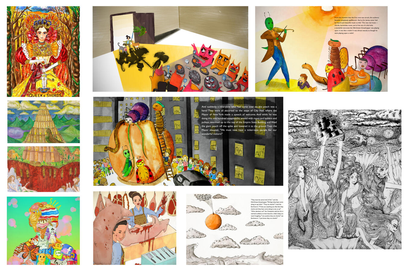
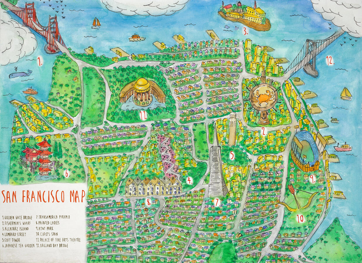
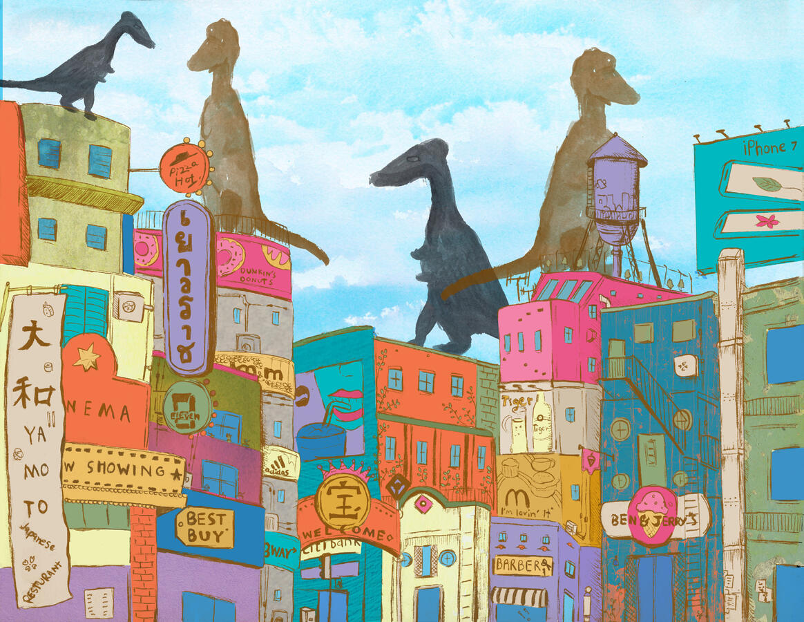
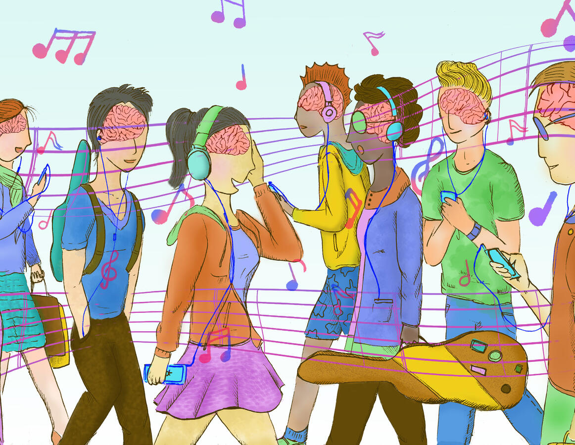
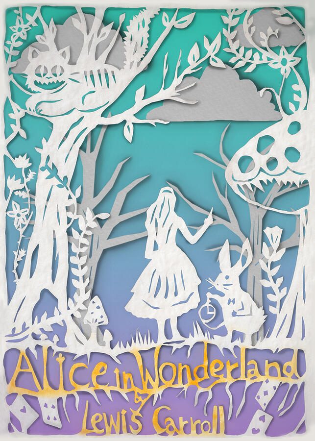
DIGITAL ILLUSTRATION
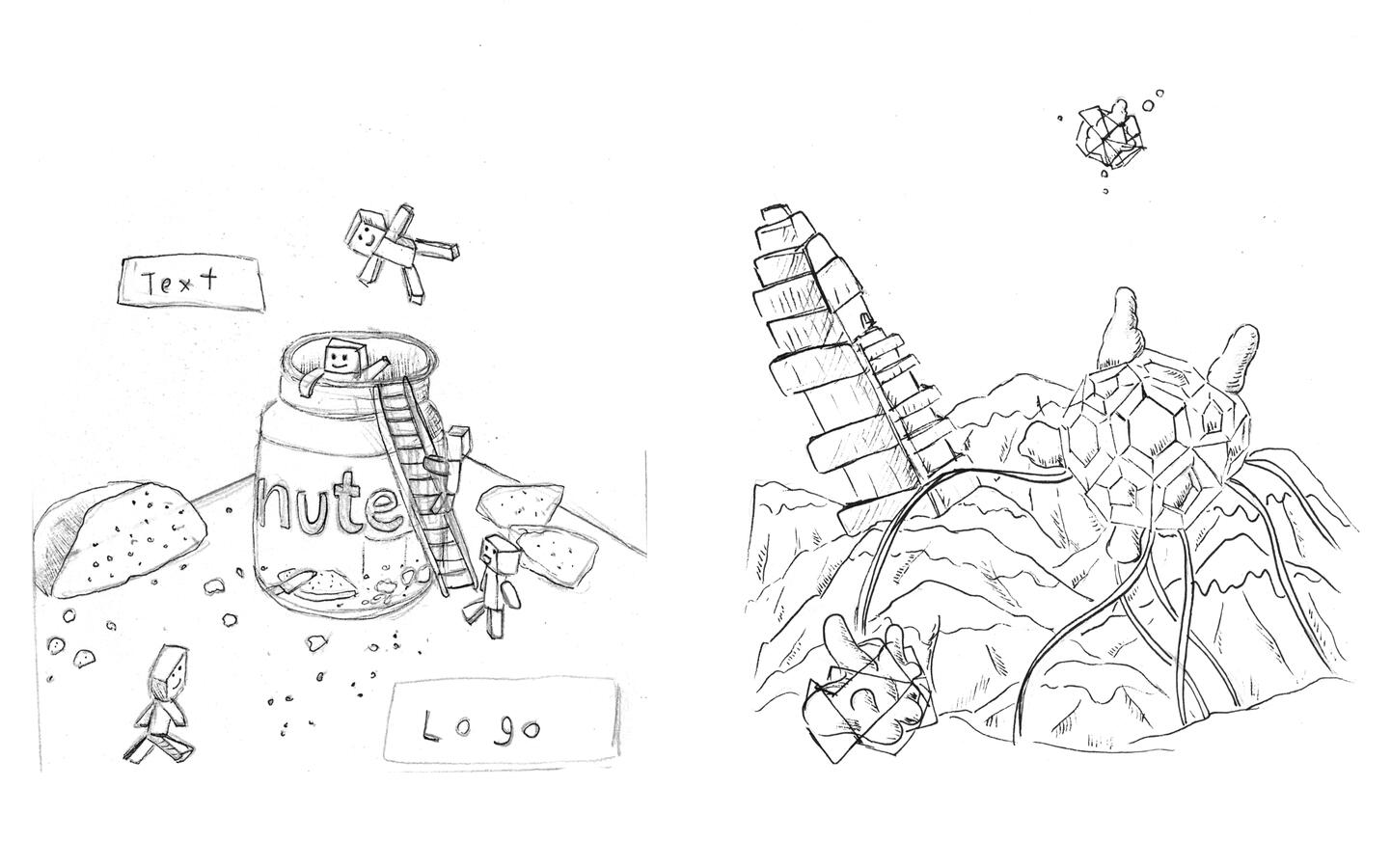
I have developed skills in creating a variety of digital illustrations, including editorial and children’s book illustrations. In my spare time, I enjoy sketching various subjects for personal enjoyment and creative exploration. My work primarily involves using Photoshop and Illustrator, though I also experiment with traditional mediums such as watercolor, acrylics, poster colors, and paper cutting. I approach each project with thorough research and begin with sketches on paper to guide my designs, always striving to create thoughtful and engaging illustrations.


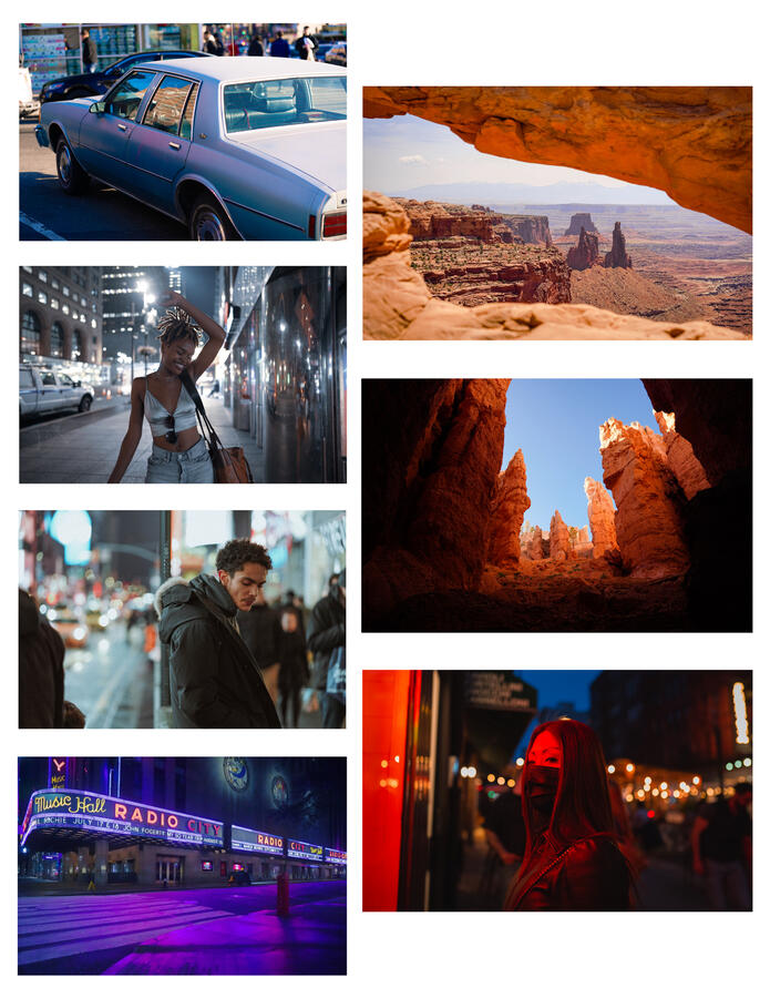
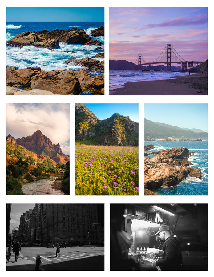
PHOTOGRAPHY
My passion for photography began during my high school years, and since then, I have developed a particular interest in capturing human moments, action, and humor. While I have also explored other genres such as landscapes, travel, and portraits, I find street photography to be especially rewarding due to the challenges it poses, requiring patience, persistence, and the occasional stroke of luck. To me, photography is an art form that requires keen observation and the ability to find beauty in the mundane. While I am constantly learning and refining my techniques, I remain humbled by the power of photography to capture life’s fleeting moments.